Color psychology in commercial spaces is one of the most powerful design tools available — and one of the most underused. Long before a visitor reads a sign or meets a member of staff, the palette around them has already shaped how they feel. The right colors can calm, energies, build trust, or drive a purchase. The wrong ones quietly work against the business every day. Here is how palette affects mood and behavior, and how to use it deliberately.
Color Is a Business Decision, Not a Style Choice
Every shade in a commercial interior sends a message about the brand and influences how people behave within the space. That makes color a strategic choice, not a finishing-stage afterthought. The question is never simply “what looks nice” — it is “what do we want people to feel and do here.”
Warm Tones: Energy, Appetite, and Urgency
Reds, oranges, and yellows stimulate. They raise energy, draw the eye, and are well known for increasing appetite and a sense of urgency — which is why they appear so often in restaurants, fast-casual dining, and retail. Used in moderation they create warmth and excitement. Used too heavily, they can overwhelm.
Cool Tones: Calm, Focus, and Trust
Blues and greens do the opposite. They lower the pulse, support concentration, and signal stability and trust — which is why they dominate offices, healthcare environments, and financial spaces. Green in particular ties into wellbeing and nature, making it a natural fit for biophilic schemes.
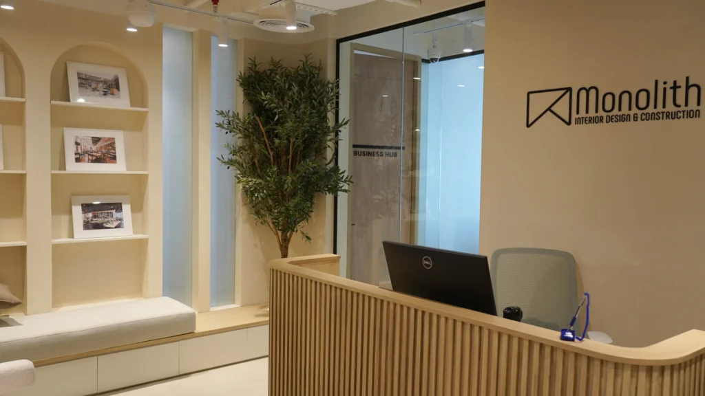
Neutrals: The Backbone of a Palette
Whites, greys, beiges, and taupes do the quiet work. They create a sense of space and sophistication and act as a backdrop that lets brand accents stand out. A strong commercial palette usually leans on neutrals for the majority of surfaces, with bolder color used intentionally where it counts.
Color and Brand Identity
Color is one of the fastest routes to brand recognition. A consistent palette across a space reinforces identity without a single logo in sight, and signals professionalism and intent. The most effective commercial interiors translate brand colors into materials and finishes rather than simply painting a wall to match.
Getting the Palette Right
Color never works in isolation. Lighting, material, proportion, and cultural context all change how a shade reads in a finished space — which is why palette decisions belong in the design phase, not at the end. With design, production, and build coordinated under one roof, Monolith’s in-house team can specify color through the exact materials and finishes that carry it, so the intent survives all the way to installation. For more on how that works, read our guide on the interior design and construction process.
Ready to Get Your Palette Working for You?
If your next commercial space should feel exactly the way your brand intends — and move people the way you want it to — let’s talk.